

In today's lesson we recieved a visit from the marketing department to demonstrate how the Orpington College prospectus was design. We were given main points to take notes of, however as we would be using this information in refence to our own magazine covers it was recommended to take record of almost everything said.
The most recent college prospectus had a very differnt design to the previous years, due to the fact that it was to now tie into the house style used by Bromley College. House style is the general layout that each issue of a magazine should follow with every issue. This includes aspects such as layout, colour scheme, type face and types of images. For instance, the image above shows a double page spread from Eco Magazine. Therefore, the magazine follows that layout for all interviews in each issue.
We were shown different mock-up boards of pages for the next college prospectus. Mock-up boards are professionally presented pages of the magazine before they are published. It includes all the images, text, mastheads, straplines and colour filters. The difference between a mock-up and a story board is that a story board is the initial ideas and can be hand drawn or created on the computer. The storyboard doesn't need to be professional as ideas may change through the developement process. Storyboards aren't only used in magazines, but all avenues of media, ie. television adverts, comic books, cartoons, etc.
The target audience is one of the main factors that needs to be taken into consideration. For example, the college prospectus not only needs to attract people of 14 to 19 to the college, but also mature students and parents and carers. Therefore issues such as reading age need to be adressed correctly, ie. the reading age used for the college prospectus is 12 to 13, so it is therefore easy to understand across the whole age range. There are also certain rules about publications that are available to the general public that are specified in the Disability Discrimination Acts 1995 and 2005. For example, for someone who has a visual impairment, the design of the prospectus should not stop them from understanding what the prospectus is trying to say. For instance, you cannot put text straight on top of images, as this may make the text harder to read. Therefore, a colour filter should be placed under the text so that there is a a constant background behind the text.
The type of images used are very important and should be consistant throughout the publication. For example, the college prosectus conecentrated on student based photograpghs, whch are usually medium close-up shots. Of course, to ensure that no potential students feel excluded, students of various different races, religions and of both sexes were used.
Abode InDesign is used the college publishing team to edit and arrange the layout of all college publications, as it is easier to stick to the house stlye. For example, one page can be edited to have particular margins and text boxes in specific places. This page can then be duplicated so that the different pages in the publication have relatively the same layout, with only slight differences. This encourages consistancy, therefore the reader can be sure that they are following the same article and avoid confusion. Photoshop is used to edit the different photographs, ie the sizes, contrast, crop and any possible filter colours.
Ihave until half term, around 4 weeks, to complete this prelimenary task, whereas the marketing time doesn't usually have more that a few days.


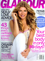
This is an example of 'house style'. I have used Glamour magazine to illustrate how publishers aim to produce a house style that is recognisable and generally consistant throughout each magazine.
Glamour's house style includes a masthead that is a bright colour and stands out from the background, but is behind the main image, which is traditionally a full body shot of a female celebrity. The image is then surrounded by various strap lines, which all happen to be in sans serif font, but in various colours and sizes.


