 For instance, this prospectus uses s harmonious colour scheme (the different shades of blue are next to each othwer on the colour wheel), which has quite a calming and sophisticated effect.
It features various different photographs of different students partaking in different activities, ie sport and ICT. This presents the reader with the impression that the school atmosphere is quite active, with lots to do as none of the featured students appear to be bored.
The school slogan is position inline with the design of the colour positions, which makes it look quite interesting. The school logo is also included so that the identity of the school is easily recognised.
This is quite a formal design, which implies sophistication so would therefore be more aimed at the parents and carers of potential students rather than the potential students themselves.
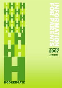
 The main difference with this prospectus from the previous one is that this one has no photographs of students or otherwise. Instead, the focus is on the graphic design. I personally think that this cover isn't as interesting as the one previous, however, I understand that the purpose of the covers are different.
This prospectus is meant to be information for parents and would therefore not need to be as expressive as though it were for students.
The layout of the cover of this prospectus is very simple and to the point with all the relevant information. It includes the year and who the information ios for.


No comments:
Post a Comment