Monday, 20 October 2008

InDesign Contents Page

This is a screen shot of the conents page that i have developed in Abode InDesign. In this version, I have made a double page spread, using one page to outline the contents of the magazine and the other to introduce the reader to the publication.


I have followed the elements of the front cover, i.e. the semi transparent circles in various shades of green and the bold sans-serif font. To make the pages more interesting, I included other photographs of students and to ensure that the theme was constant throughout the publication, I edited the photographs so that they were round.

This is a second contents page that I completed and the main change was that this is a single page spread, whereas the one previous was a double page spread.
Again, I have done my best to stick to the house style that I created with the front page.


Thursday, 16 October 2008

InDesign Cover

This is the cover of the Orpington College student magazine that I have developed in Abode InDesign.

The specifications for the cover were:
* to have one medium close up image of a student
* to include at least two straplines
* to only use sans-serif font
* to have a theme that will run into the contents page.

As my theme I have chosen to use green semi- transparent circles over the main image. I chose to use green as this a typical colour used by the college publishing team and therefore is a colour that is generally associated with the college. Blue is also a colour associated with Orpington College (as you can see the subject of the main image is wearing a tag from the college which is blue), but I chose green because I feel that it is a warmer colour than blue and therefore more welcoming.


Monday, 13 October 2008

Cover and Contents Page Plans


Before I can start to use InDesign to layout my front cover and contents page for my version of orpington college magazine, which I have named 'OC Life', I have to plan out how they will look. I have done this on paper, so that i can edit my different ideas as I go along. I have decided to start with two totally different designs, and then use different elements from each of them that I like.


This my plan for my front cover.


Box 1: The MastHead, in bold sans-serif font and in an appropriate colour that suits the main image.

Box 2: The Main Image, a medium close up of a student, edited on Photoshop to get rid of any flaws.

Box 3: The Straplines, outlining various features within the magazine

Box 4: the date and college logo


Friday, 10 October 2008

InDesign CS3

Throughout this week we have been experimenting and using with Indesign, a programme that is used by professionals in the various avenues of the media industry to layout the page of magazines, newpapers and other publications.
Indesign has various features which enable the user to complete various different designs, such as guideline which allow you to space and position the different elements of a page correctly and to the house style. The house style is very important for the identity of a publication, as the pages are of a consistant layout and design to show flow from article to article.

Using the student photographs that we have taken previously, we have started to design and edit our front covers of our student magazines. We had previously completed quick sketchs of ideas for our front covers on paper so that we had an original idea to work from when it came to working with InDesign.

We were introduced to InDesign and shown the various tools that we might find helpful in completing our covers. There were tools that you would expect in any desktop publishing programme, for example:
  • the text tool: this allows you to insert text into a designated box, and is similar to the 'type on path tool' where you can type on a line and therefore in different directions and at different angles.
  • the select tool: this simply allows you to select points and elements that you want to work with.
  • the hand tool: allows you to 'pick up' and move different elements of the page.
  • the pencil tool
  • the shape tool
  • the zoom tool
  • the eyedropper tool

However, there are many different tools in InDesign, which toegether make it very different to any other publishing programme. For example, the fitting tool allows you to fit an image into a certain shape.


Monday, 6 October 2008

Photoshop

In today's lesson we started to use Photoshop properly, experimenting with different functions and what effects would be most appropriate to our student magazine covers. Of course the tools we use are totally dependent on the overall message that we want the cover to express, ie. do we want it to be fun and entertaining or deal with serious issues that would be relevant to the reader.
I want my magazine to be quite sophisticated, therefore I wouldn't be doing anything extreme to any of my photographs, ie making obvious colour changes or drawing using the paint or pen tools. However, I could edit the image to make it lighter, or to reduce any shine that could be a distraction.
I couls also AirBrush the image. This is used heavily in industry to cover all flaws of a subject to show perfection.
The photograph that I have chosen I don't consider to need any serious editing, not only because the main focus is quite a good representation of the college, but also because I am going to use the background of the image for the background of the whole page.

Saturday, 4 October 2008

Photoshop Research

On Monday's lesson we be formally introduced to Photoshop and its various features. Therefore, in preparation, I have look at some the the effects that Photoshop is used for and found this video, which features editing techniques used when editing close ups and medium close ups.


I converted this video from YouTube using Movavi Onilne Video Converter. It was made by Rodrigo Brassane for brassane.com

Wednesday, 1 October 2008

Prospectus Covers

To aid me with designing and organising my the cover for my own college magazine, I will analyse some different school/ college prospectuses. College prospectuses are designed not only to attract to potential students to the college, but also their parents and carers.

For instance, this prospectus uses s harmonious colour scheme (the different shades of blue are next to each othwer on the colour wheel), which has quite a calming and sophisticated effect.

It features various different photographs of different students partaking in different activities, ie sport and ICT. This presents the reader with the impression that the school atmosphere is quite active, with lots to do as none of the featured students appear to be bored.

The school slogan is position inline with the design of the colour positions, which makes it look quite interesting. The school logo is also included so that the identity of the school is easily recognised.

This is quite a formal design, which implies sophistication so would therefore be more aimed at the parents and carers of potential students rather than the potential students themselves.

The main difference with this prospectus from the previous one is that this one has no photographs of students or otherwise. Instead, the focus is on the graphic design. I personally think that this cover isn't as interesting as the one previous, however, I understand that the purpose of the covers are different.

This prospectus is meant to be information for parents and would therefore not need to be as expressive as though it were for students.
The layout of the cover of this prospectus is very simple and to the point with all the relevant information. It includes the year and who the information ios for.


Monday, 29 September 2008

Marketing Workshop


In today's lesson we recieved a visit from the marketing department to demonstrate how the Orpington College prospectus was design. We were given main points to take notes of, however as we would be using this information in refence to our own magazine covers it was recommended to take record of almost everything said.

The most recent college prospectus had a very differnt design to the previous years, due to the fact that it was to now tie into the house style used by Bromley College. House style is the general layout that each issue of a magazine should follow with every issue. This includes aspects such as layout, colour scheme, type face and types of images. For instance, the image above shows a double page spread from Eco Magazine. Therefore, the magazine follows that layout for all interviews in each issue.

We were shown different mock-up boards of pages for the next college prospectus. Mock-up boards are professionally presented pages of the magazine before they are published. It includes all the images, text, mastheads, straplines and colour filters. The difference between a mock-up and a story board is that a story board is the initial ideas and can be hand drawn or created on the computer. The storyboard doesn't need to be professional as ideas may change through the developement process. Storyboards aren't only used in magazines, but all avenues of media, ie. television adverts, comic books, cartoons, etc.

The target audience is one of the main factors that needs to be taken into consideration. For example, the college prospectus not only needs to attract people of 14 to 19 to the college, but also mature students and parents and carers. Therefore issues such as reading age need to be adressed correctly, ie. the reading age used for the college prospectus is 12 to 13, so it is therefore easy to understand across the whole age range. There are also certain rules about publications that are available to the general public that are specified in the Disability Discrimination Acts 1995 and 2005. For example, for someone who has a visual impairment, the design of the prospectus should not stop them from understanding what the prospectus is trying to say. For instance, you cannot put text straight on top of images, as this may make the text harder to read. Therefore, a colour filter should be placed under the text so that there is a a constant background behind the text.

The type of images used are very important and should be consistant throughout the publication. For example, the college prosectus conecentrated on student based photograpghs, whch are usually medium close-up shots. Of course, to ensure that no potential students feel excluded, students of various different races, religions and of both sexes were used.

Abode InDesign is used the college publishing team to edit and arrange the layout of all college publications, as it is easier to stick to the house stlye. For example, one page can be edited to have particular margins and text boxes in specific places. This page can then be duplicated so that the different pages in the publication have relatively the same layout, with only slight differences. This encourages consistancy, therefore the reader can be sure that they are following the same article and avoid confusion. Photoshop is used to edit the different photographs, ie the sizes, contrast, crop and any possible filter colours.

Ihave until half term, around 4 weeks, to complete this prelimenary task, whereas the marketing time doesn't usually have more that a few days.


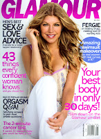
This is an example of 'house style'. I have used Glamour magazine to illustrate how publishers aim to produce a house style that is recognisable and generally consistant throughout each magazine.
Glamour's house style includes a masthead that is a bright colour and stands out from the background, but is behind the main image, which is traditionally a full body shot of a female celebrity. The image is then surrounded by various strap lines, which all happen to be in sans serif font, but in various colours and sizes.

Saturday, 27 September 2008

Semiology


The aim of yesterdays lesson was to understand the meaning of Semiology and how to apply it to the various different analysis that we should conduct throughout the course.

The definition of semiology is: the study and interpretation of signs and their meanings. In this case, I will be using semiology to carry out textual analysis, which is decipering text to gain meaning from it.

A sign is anything that has meaning and can be broken down into two parts: the signifier and the signified. The signifier is the form that the sign takes, ie. a picture or sound and the signified can be both denotation (the common agreed meaning) and connotation (my individual interpretation).

For example, above is a picture of a lion therefore the signifier is a picture. The signified denotation is the agreed meaning of this sign is an mystical creature called a dragon. The signified connotation is that this sign leads me to think of power and strength.


Semiology is used heavily throughout the publishing industry to visually indicate an idea or theme.

Other vocabulary that is included in this subject are:
  • iconic: look like, what they represent, ie. a photograph of you
  • symbolic/ arbitrary: meaning must bhe culturally learned, therefore they may not look like waht they are meant to represent, eg. a no entry sign.
  • indexical: have a connection to what they represent and are suggestive rather than directly resembling, eg no smoking sign, crucifix.

These words are all used to analyse/ describe signs.

Friday, 26 September 2008

Student Photographs


For Wednesday's lesson, each member of my AS Media class was given a camera to take head shots of students around the college. We were also given a sheet of the different types of shots that we needed, which were:
  • MCU of person standing up

  • MCU of person sitting down
  • MCU of person outside (with background)

  • MCU of person inside (with background)

  • MCU of person in high angle shot

  • MCU of person in low angle shot

I have uploaded the photographs I have taken onto my Flickr account and will be soon analysing my favourite image that I will use for the cover of my college magazine.


This is a medium close up shot of a college member of staff, however, I close this image as she could easily pass for a student.


There is very good lighting in this shot, which means that I will not have to lighten it in any photo editing software.
I have two options regarding cropping this image; I could either leave it as is, with the subject slightly to the right, or I could crop it so that the subject is in the direct centre. However, if I chose to crop this photograph, I risk not having any space to put any text, including a masthead and any sub topics.

I could also blank out the background and make it one block colour. However, I like the background and feel that it reflects the fact that this is a college photograph and the college atmosphere.
I also like the fact that the subject is wearing a tag, which is exclusive to college staff.
I could edit this to get rid of any flaws on her skin and reduce the shine.