As my magazine was very conventional, it challenged very few of the existing forms of music magazines. I followed the conventions of hiphop music magazines in terms of layout, colour scheme, images, content and tone.
Layout: Hiphop magazines tend to have quite straight layouts, with text and images following guidelines to ensure all elements are straight. This is to create cohesion and is juxstaposed to the nature of the images. The layout is connected to the housestyle, therefore the layout tends to be generally the same across all the pages of the magazine, bar the main feature article and adverts. I used columns to organise the text in the feature article and the contents page. This is a convention of many magazines, not just hiphop magazines. This way of organisation causes the reader to move around the pages in a structured way so that they look at all the elements of the page including all the text and images.
ColourScheme: Another feature of magazine housestyles is the colourscheme. Hiphop magazines tend to have quite dark colour schemes that reflects the attitude of the genre of music. I had quite a dark clour scheme for my magazine, as chosen by my target audience when doing the questionnaire that I distributed. However, for the faeture article I included a neon colour scheme to make it stand out from the rest of the magazine. I was inspired by the latest Shystie video and felt this was relevant because she was also my feature artist.
Images: The images that I used in my magazine were all taken by me because they all had to be primary, i.e. hadn't been used before. I looked at existing magazines and analysed the different features, i.e. the camera angle, the camera shot, scenery and subject. Therefore, when taking and editing my photographs I followed the same canmera angles and shots to follow the conventions of a hiphop magazine. I took the photographs at night to reflect the dark atmosphere of the magazine and the attitude of the artist I featured.
Therefore, the magazine pages that I have produced do not challenge the conventions of hiphop magazines to a great degree, however I have made some changes to make my magazine individual i.e. the bright colour scheme.
My publication represents a particular social group through the choice of artist. I chose someone who was of a similar age to my target audience therefore the readers could relate to the feature article. I also ensured that the language that I used was targeted correctly towards my target audience, using standard english combined with contemporary slang. I did this so that my target audience would feel included in the magazine; like it was espeshially written for them.
One of the current fashion trends is 'crunk', which involves wearing clothes of very bright neon colours. I have conveyed this through my magazine by using the same bright colours in the images and for the taglines in the feature article. I felt this was important because if the audience did not feel included, they would be less inclined to buy the magazine.
I would distribute my magazine in typical publication outlets such as newsagents and popular stationary shops such as WH Smiths. This is because there is already an established market and therefore potential consumers are available. I would also consider distributing my publication through stores that my target audience would be interested in, such as Zavvi and HMV. These stores already have a small section for magazines and books therefore my magazine would not look completely out of place on the shelves. However, I would also aim to distribute my magazine at public event aimed at my target demographic, such as music concerts.
However, if I chose to become part of a publishing group, such as VibeMedia, my publication would be distributed according to areas where there is a high percentage of my target demographic, i.e. the outer London boroughs.
The audience for my media product, a uk hiphop and r'n'b magazine, is young people aged between 14 and 22 in full or part time education. This is because this is the demographic that listen to this genre of music to the greatest degree and would be most willing to spend money as they have the most disposable income.
I addressed my audience in terms or laguage choice, register and image. I used informal language that could be understood by all of my target demographic. I encorporated contemporary slang into the feature article to make it more realistic. I used images that were very straight forward and used props that would be known by the audience, i.e. mobile phones.
I also used very dark colours to reflect the grittiness of the genre of music.
To produce my magazine the main sources of technology I used were Photoshop and InDesign. I used Photoshop for image manipulation, however because I had little experience with the programme before I found it quite difficult to use and therefore avoided using it a great deal, espeshially when cropping an image. However, I did the best I could and focused of colour changes to make them more interesting to the target demographic. I also used InDesign to layout the elements of my magazine pages. I found this alot easier to use than Photoshop, although I had the same limited experience. Because I found it so easy to use I was able to experiment with the layout alot before I came to a final desicion. Another technology I used was the internet. This was vital as this was the only was I could update my blog and find the different magazine covers to analyse. However, it became a huge problem when my home internet stopped working so I had to double my workload in class. However, with good time management it wasn't such a problem as I first thought it would be.
The preliminary task was great help in preparing me for the main task, as I understood the impotance of time management. I recieved quite a high mark for the first task, but I was aware that if my research had been better I could have achieved more. Therefore, in this task I ensured that everything I did was to the highest possible standard and that I recorded everything I did day by day. I learnt that even if the final product isn't of the highest standard, aslong as everything is justified marks can still be gained.
If I had more time I would probably take the photographs for my magazine again, because I don't feel that they were as good as they could have been. For example, I would have liked to have put the masthead behind the subjects head but I couldn't crop the image properly. I would have also liked to use a different colour scheme, but I could not change this because this is a factor that my target demographic chose.
Friday, 9 January 2009
Tuesday, 23 December 2008
Finished!!
Friday, 19 December 2008
Deadline Extension
Today is the deadline for my final magazine cover, contents page and feature article...
...HOWEVER...
I have been given an extension until a week after the christmas holidays. I have already complete all the work that I needed to do, but this will give me the oppotunity to nsure that all my work is to the highest possible standard. =]
...HOWEVER...
I have been given an extension until a week after the christmas holidays. I have already complete all the work that I needed to do, but this will give me the oppotunity to nsure that all my work is to the highest possible standard. =]
Thursday, 18 December 2008
Monday, 15 December 2008
Screenshots and Processes
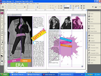
Elements Arrangement: I used the selection tool to move the different parts of my pages around. This allowed me to move images, text boxes and blocks of colour to the positions that I wanted and also allowed me to resize them.
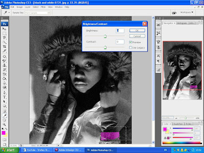
Brightness/ Contrast: this tool allowed me to select the range of shadow and highlighting that I wanted.

Grey Scale: this allowed me to choose exactly how greay I wanted the image to be
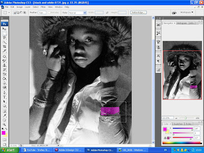
Selection: This allowed me to select everything in a particular area. For example, I only wanted to recolour one bracelet so I selected the area to make it easier to work with.

Move and Rotate:

Arrange: bringing something to the front means that it appears in front of other elements. For example, I wanted the block of colour to be infront of the image and the text to be infront of the coloured block.
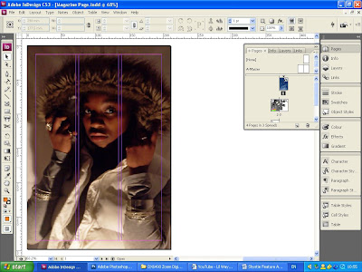
Page Layout:
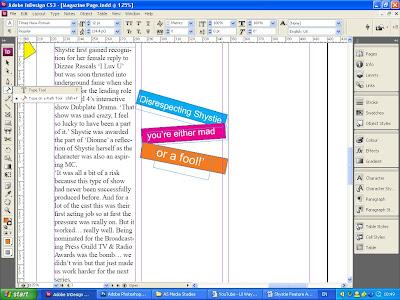
Text Tool: In InDesign I could have either chosen to use the Text Tool or the Type on Path Tool. I chose to use the Text Tool and then rotate it to the angle I required using the rotate tool. I also used the rotate tool to move the colour bars that I used as backing for the text quotes.

Text Tool: In InDesign I could have either chosen to use the Text Tool or the Type on Path Tool. I chose to use the Text Tool and then rotate it to the angle I required using the rotate tool. I also used the rotate tool to move the colour bars that I used as backing for the text quotes.

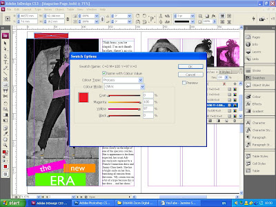
Colour Change: this was done using the colour balance tool. By selecting varying densities of different hues, I was able to create a colour customed to the image I was using. For exaple, in this case I used 100% magenta, 0% cyan, 0% black and 97% yellow to create a fushia tone for the last of the three images on the right hand page.
Saturday, 13 December 2008
Photograph Editing
Friday, 12 December 2008
Inspiration
From the results of my questionnaire and my research of relevant music magazines, I have concluded that the best colour scheme for the house style of my magazine would be grey, black, red and white.
However, to make the feature article stand out, I have chosen to use a different colour scheme for the two page spread. I have taken my inspiration for this new colour scheme from Shystie's latest music video, video features a very heavy neon colour scheme.
I plan to encorporate this colour scheme not only into the page design but also into the photographs themselves.
Thursday, 11 December 2008
HipHop Connection Contents Page Analysis
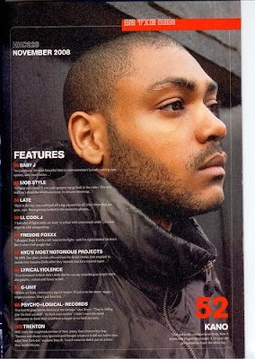 Main image is a medium close up from the side. The subject appears to be focused on something in the distance, making him appear detached from the reader. The main colour used in the image is black, for example he appears to be leaning against a black door frame and is wearing a black coat. his face is the only part of the image that has nothing covering it, therefore making it the main focus of the entire image. The image appears to be slightly manipulated to clear the image of any imprefections, but at the same time it has been edited so that air brushing is minimal and the image is still gritty and relates well to the ambience of the magazine. The taglines are listed on the left hand side and only cover just over a quarter of the page. This is quite organised and is therefore easy to read and the audience can find what might interest them quickly. There is a segmented banner at the top of the page, which stand otu because it has a red background and white text. The font used for all the text across the page in all sans-serif and some parts in bold. The two colours used for text are red and white which stand out against the background. Some of the font is in bold and these appear to be the more important titles, whereas the font that is not in bold provides extra information and details. The date at the top of the page is seperated from the rest of the text, but is in bold, possibly to signify importance.
Subscribe to:
Comments (Atom)


