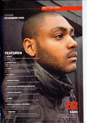
 Main image is a medium close up from the side. The subject appears to be focused on something in the distance, making him appear detached from the reader. The main colour used in the image is black, for example he appears to be leaning against a black door frame and is wearing a black coat. his face is the only part of the image that has nothing covering it, therefore making it the main focus of the entire image. The image appears to be slightly manipulated to clear the image of any imprefections, but at the same time it has been edited so that air brushing is minimal and the image is still gritty and relates well to the ambience of the magazine. The taglines are listed on the left hand side and only cover just over a quarter of the page. This is quite organised and is therefore easy to read and the audience can find what might interest them quickly. There is a segmented banner at the top of the page, which stand otu because it has a red background and white text. The font used for all the text across the page in all sans-serif and some parts in bold. The two colours used for text are red and white which stand out against the background. Some of the font is in bold and these appear to be the more important titles, whereas the font that is not in bold provides extra information and details. The date at the top of the page is seperated from the rest of the text, but is in bold, possibly to signify importance.
Thursday, 11 December 2008
HipHop Connection Contents Page Analysis
 Main image is a medium close up from the side. The subject appears to be focused on something in the distance, making him appear detached from the reader. The main colour used in the image is black, for example he appears to be leaning against a black door frame and is wearing a black coat. his face is the only part of the image that has nothing covering it, therefore making it the main focus of the entire image. The image appears to be slightly manipulated to clear the image of any imprefections, but at the same time it has been edited so that air brushing is minimal and the image is still gritty and relates well to the ambience of the magazine. The taglines are listed on the left hand side and only cover just over a quarter of the page. This is quite organised and is therefore easy to read and the audience can find what might interest them quickly. There is a segmented banner at the top of the page, which stand otu because it has a red background and white text. The font used for all the text across the page in all sans-serif and some parts in bold. The two colours used for text are red and white which stand out against the background. Some of the font is in bold and these appear to be the more important titles, whereas the font that is not in bold provides extra information and details. The date at the top of the page is seperated from the rest of the text, but is in bold, possibly to signify importance.
Subscribe to:
Post Comments (Atom)


No comments:
Post a Comment